BRAND SPOTLIGHT: Behind the Tinys Milk & Cookies Logo
THE CHALLENGE:
The most recent addition to Tiny Boxwoods Productions (but not for long!) is the brainchild of chef and founder Baron Dokehe. Being the kid brother to Tiny’s No. 5, Milk & Cookies needed a brand identity system that would feel connected, but also stand out on its own.
THE INSPIRATION:
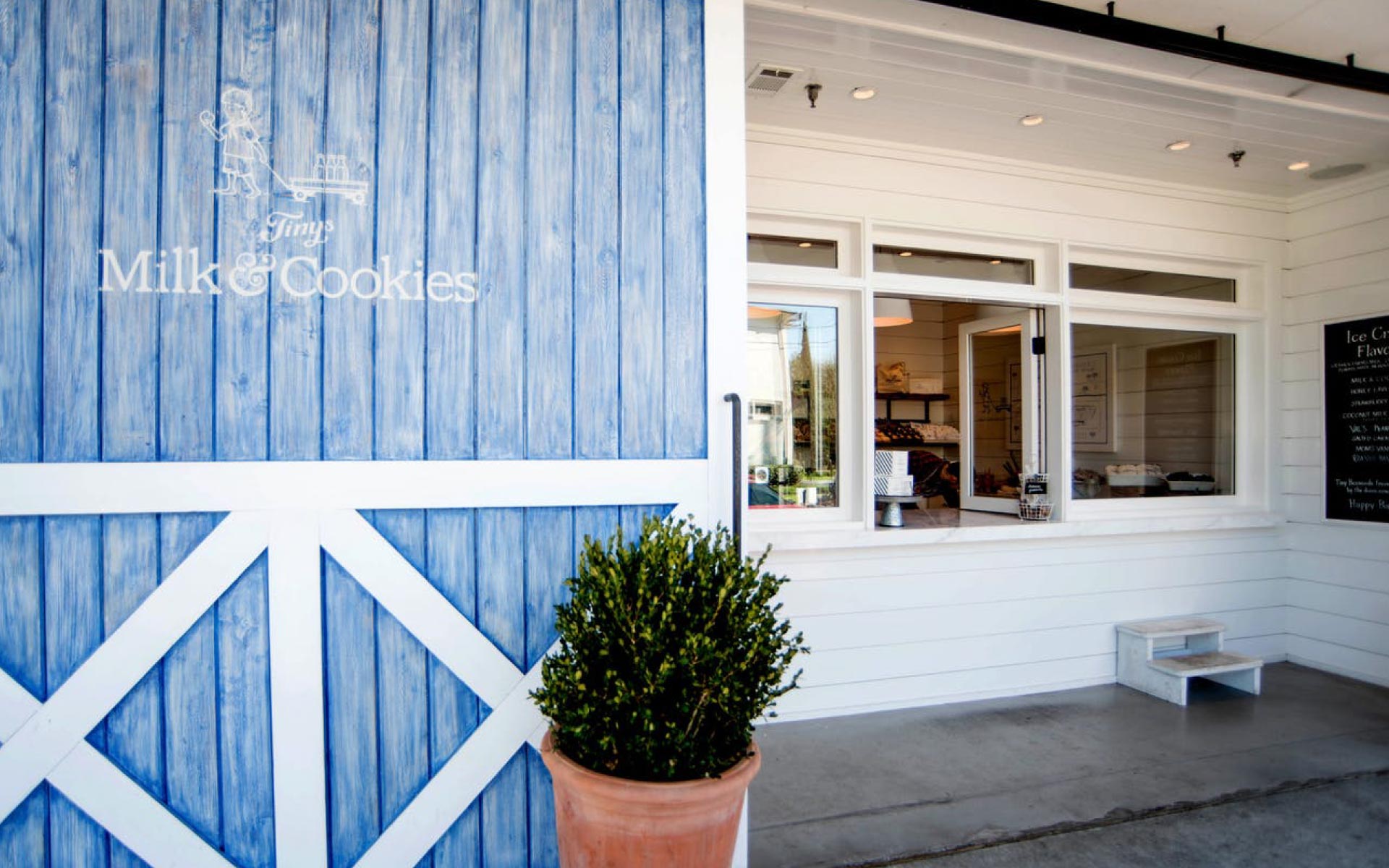
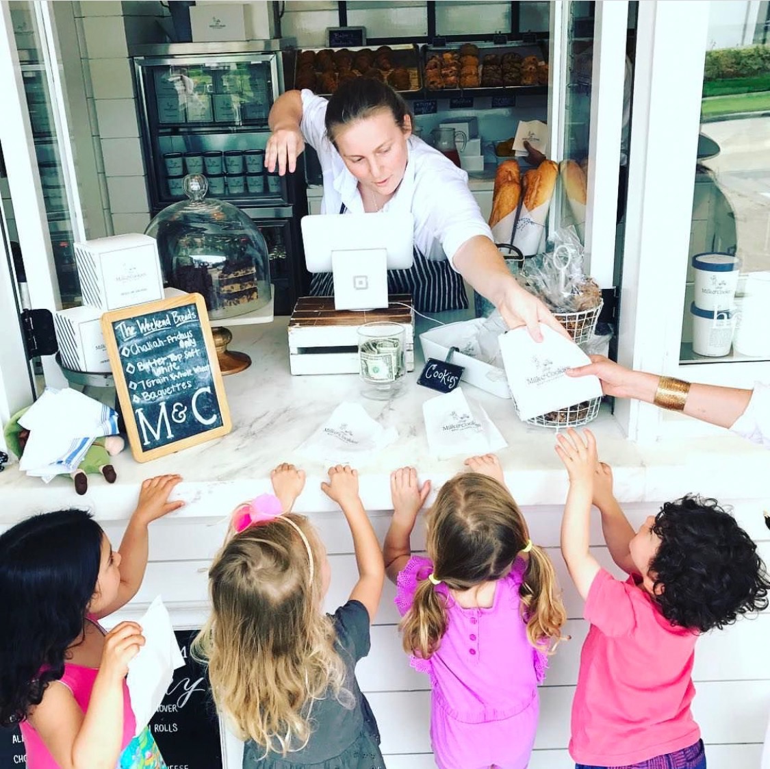
In the heart of one of the country’s biggest cities is a neighborhood that gives off a Norman Rockwell vibe. West University is the kind of place where kids still run from the baseball field to the playground while parents lag behind, wagon in tow. What is now Milk & Cookies, used to be an old general store called JMH – a neighborhood institution serving the community for nearly 60 years. It operated on a family tab system, of which local children took full advantage through the frequent after-school ice cream purchase.
THE RESULTS:
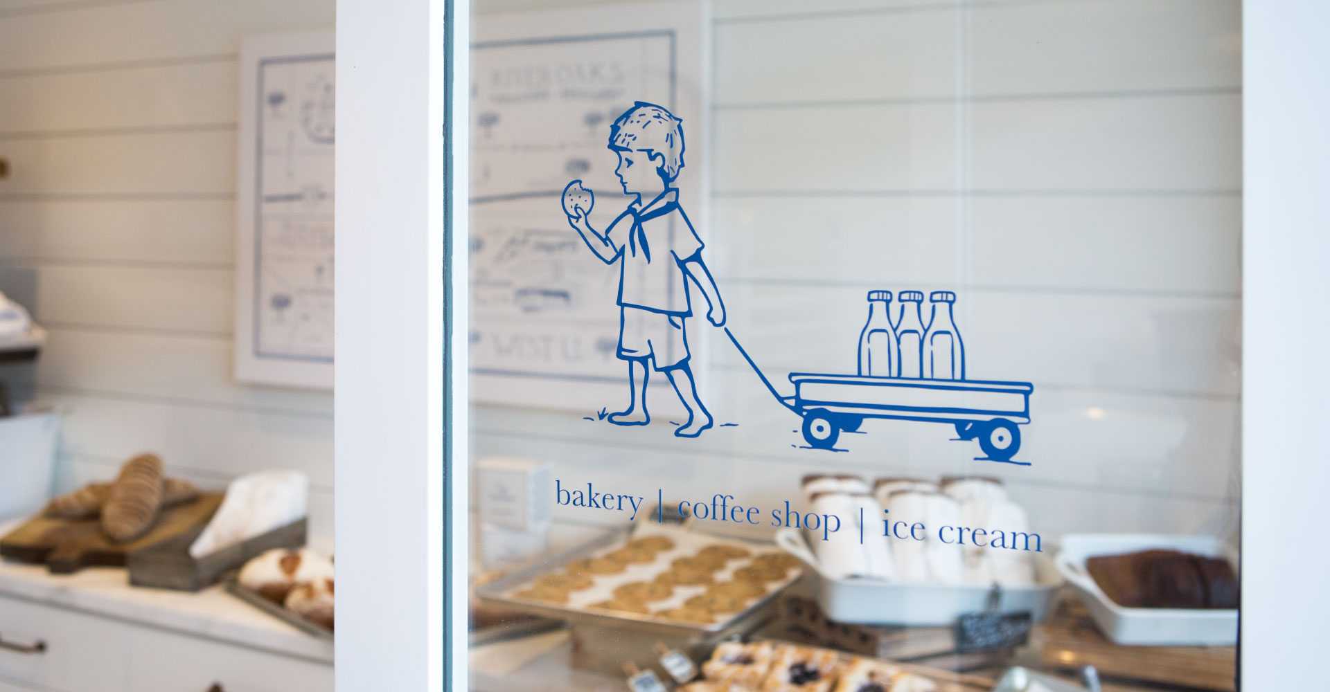
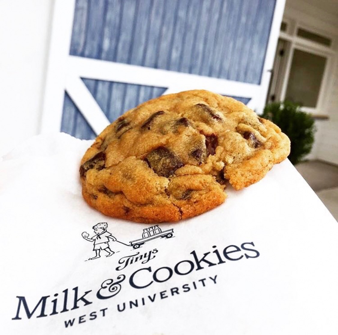
We developed a logo that maintains the same handcrafted elements of the parent brand and captures the quaint history and tradition of the neighborhood. It features an iconic hand-drawn illustration of a barefoot boy eating a cookie and pulling a Radio Flyer wagon. It evokes a sense of youthful delight and harkens back to simpler times.
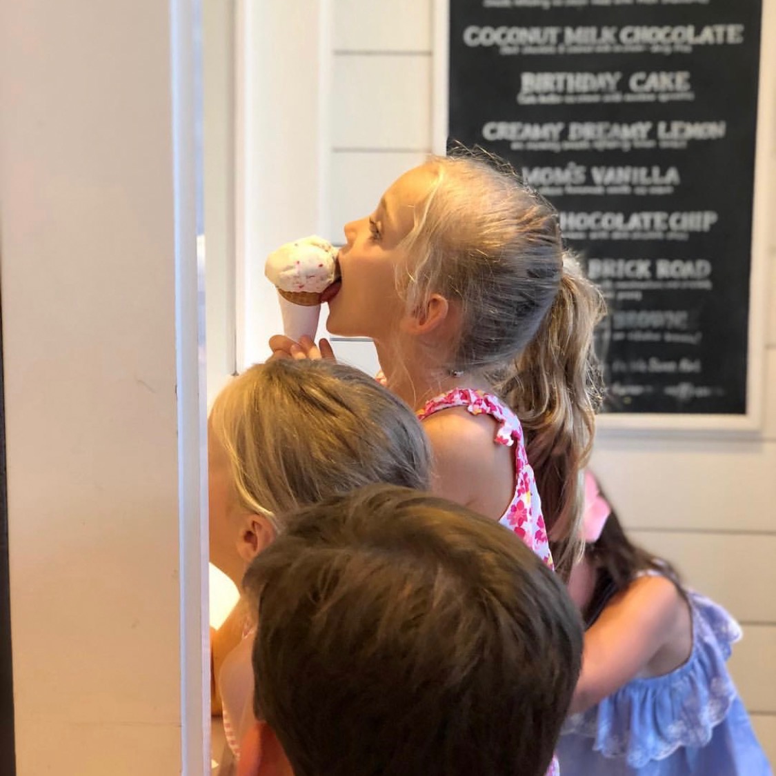
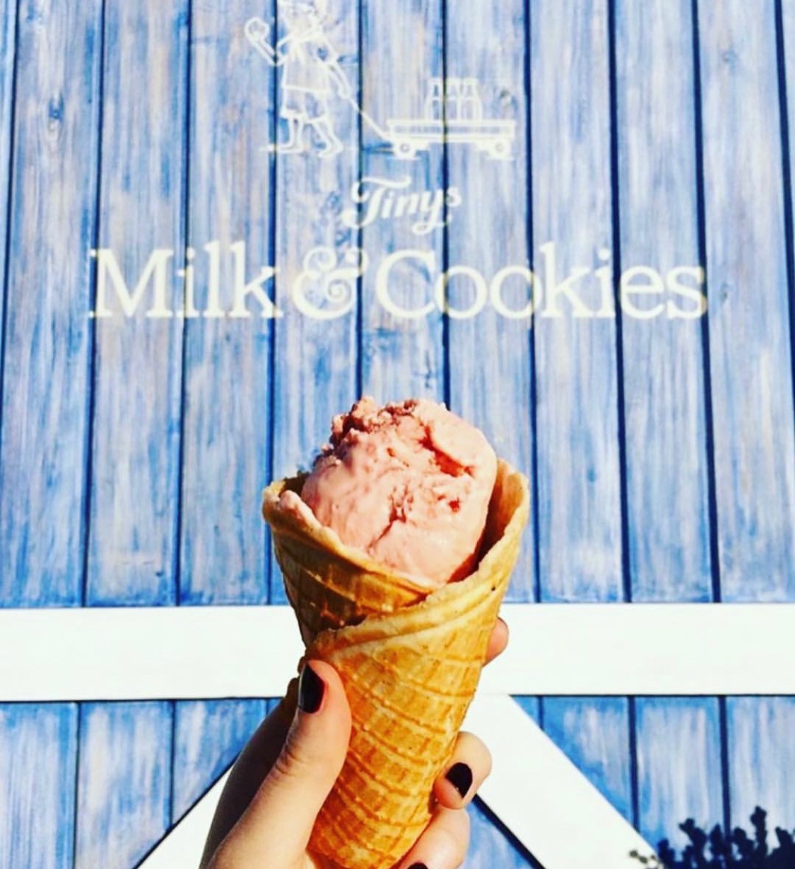
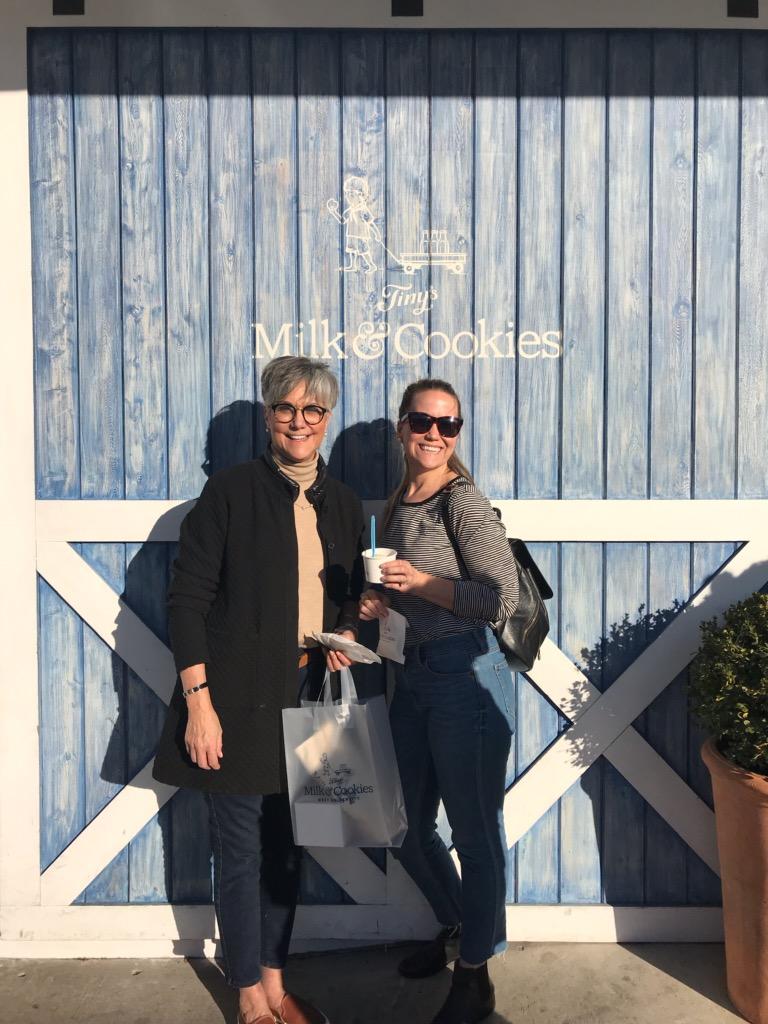
Today, you will most likely find a line formed down the sidewalk to the sliding barn doors of Tinys Milk & Cookies. The walk-up window offers a sweet selection of treats: ice cream, coffee, and the best chocolate chip cookie in town. It has quickly become a place where time slows down and folks stop in to enjoy the life’s little moments.
* COMING SOON! Tiny’s Milk & Cookies Austin is slated to open March 2019.