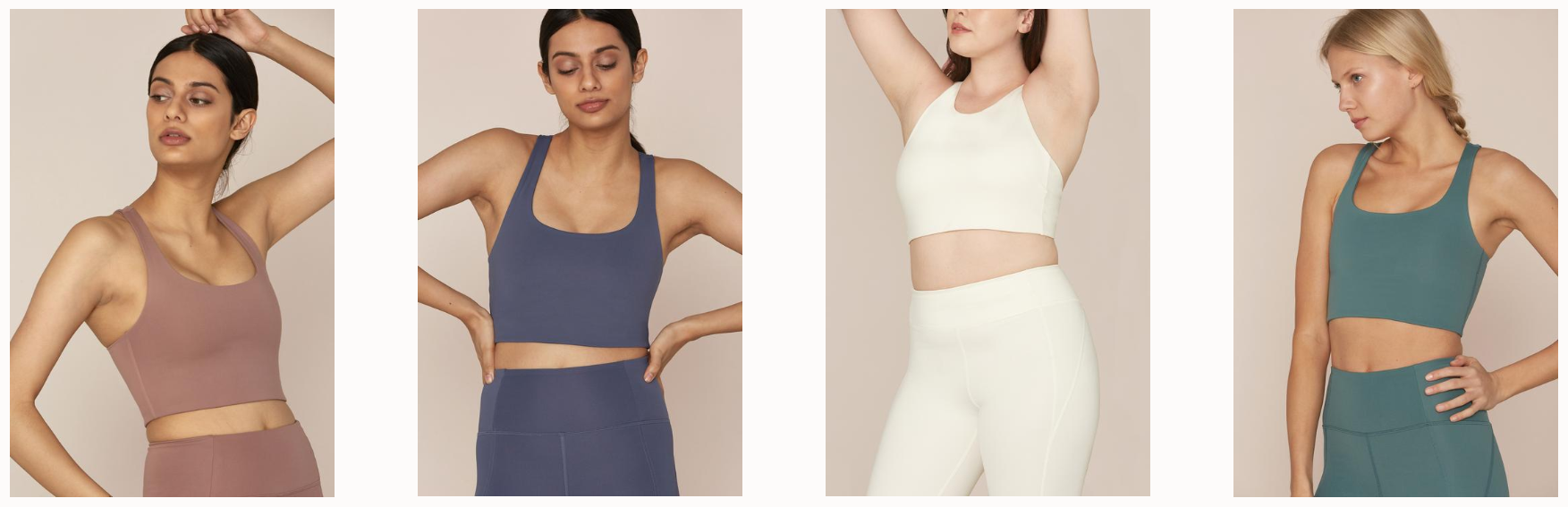
Image courtesy of Girlfriend Collective
Image courtesy of Girlfriend Collective
TREND ALERT: MONOCHROME
One of the latest trends in fashion, interior design, web design, graphic design, and undoubtedly across branding and packaging design relates to color – in its most simple form. The one-color palette, or monochromatic color scheme, has proven again and again to be a timeless trend and creative way to express brand identity. If executed well, a monochromatic design can make any design shine with cohesive elegance.
NEED-TO-KNOW COLOR TERMS:
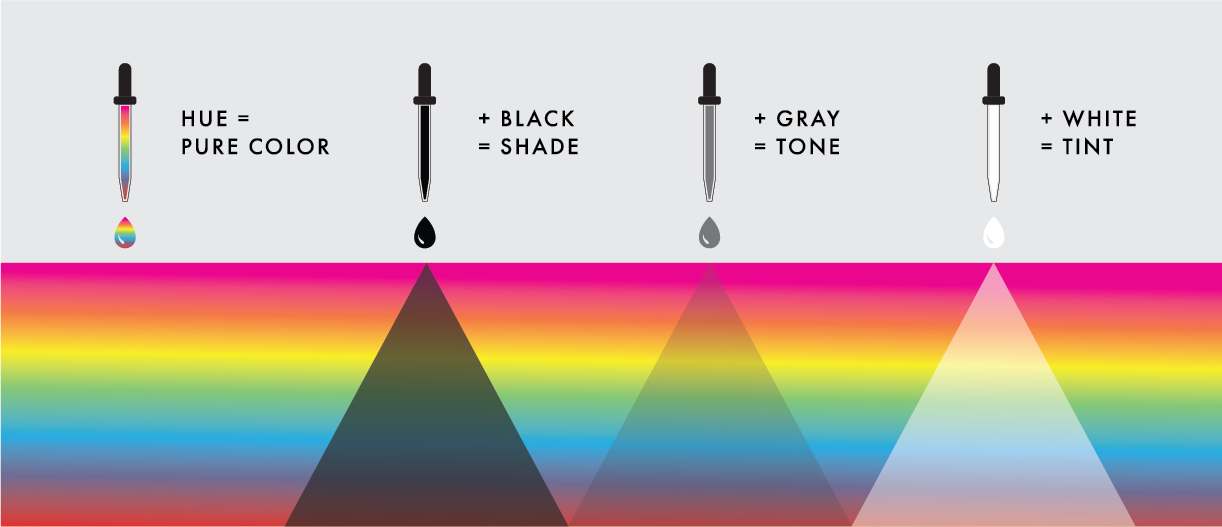
Hue – synonymous with “color.” (Includes all primary and secondary colors)
Shade – The addition of pure black to any color to make it darker.
Tone – The addition of gray to any color to make it richer.
Tint – The addition of white to any color to make it lighter.
Via 99designs.com
Monochromatic means to use a single hue. Color is a general term used to denote different tints, tones or shades of one hue. A hue is the root or base color, and becomes a color by the addition of white, gray or black. A monochromatic scheme begins with a hue and any additional colors used in the palette would be variations of that hue in shades, tints, or tones. Summary: there is only one main color in the design (i.e., red) instead of the combination of various colors and hues.
WHY MONOCHROMATIC?
When effectively applying color to a design project, one needs balance and the more colors applied to a design, the more complicated it is to achieve balance. With a monochromatic color scheme, the options are still limitless, but balance is more easily attainable.
Alongside the wide range of versatility, the one-color palette creates a harmonious and cohesive look/feel while letting your content and design shine on its own. The simplicity of having one hue of various tints, tones, and shades showcases a common theme and can help associate brands with a memorable color. In addition, this one color scheme may ultimately make your job as a designer a little easier without having to pick colors and wonder if they complement one another.
In the end, you’re able to expand your color choices with a monochromatic color scheme without overwhelming your design with a rainbow of colors.
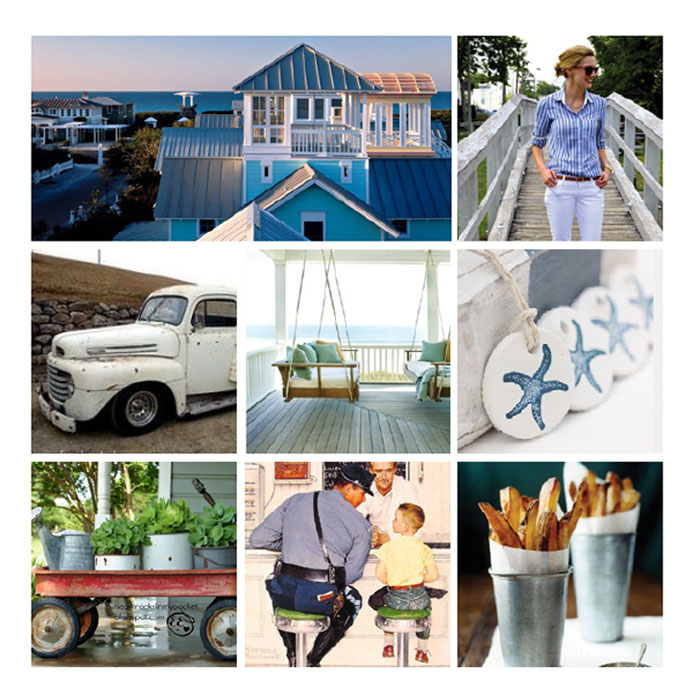
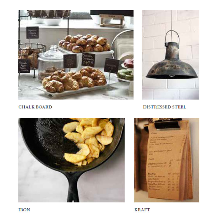
BRAND EXAMPLES
When developing color palettes for our clients, we typically start with mood boards to depict the look, tone, and feel. Here are a few examples that demonstrate monochromatic color schemes and the inspiration behind each.