WELL-TAILORED TYPOGRAPHY, AND WHY IT MATTERS
Authored by Cole Johnston
These days, we are bombarded by messaging – marketing emails, advertisements, billboards, restaurant menus, magazine covers…the list goes on. Typography plays an important role in how we perceive those messages both consciously and subconsciously. I will not touch on the psychological effects or readability of good vs. bad typography, but would like to spend a moment to explain why I think typographic choices are vital to building a great brand.
To me, picking the right typeface(s) for your brand is a lot like picking out the perfect outfit. Similar to clothing, typography has evolved in both style and trends over generations. And, much like the return of your father’s 1950s Brooks Brothers skinny tie to fashion, typography is cyclical.
My own type library looks much like a fantasy wardrobe closet, and in many ways, it is. From serifs to sans serifs, regular to condensed, the ‘wardrobe’ combinations are endless. With so many choices, it is important to know what works, why and when.
We all have a friend whom we admire for his unique style. While we may not be able to pinpoint what makes him ‘buttoned up,’ or ‘the only person that can pull that off,’ he stands out in our minds because he has established a style that is his own. Many of the same choices your friend makes when compiling a wardrobe, are similar to the choices you should consider when selecting typography.
Just as you can imagine how your daily outfit choices reflect how others think of you (for better or worse), so too will your typographic choices reflect your brand character.
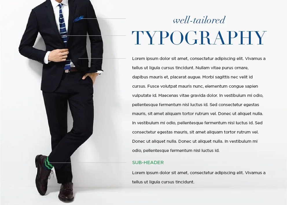
When I chose a typeface for a brand, I visit my type closet and ask myself, ‘Who am I dressing for?’ ‘What impression do I want to leave?’ And sometimes, ‘Will I have to change?’ Should I pick out a bold tie (display type), and wear it with a comfortable classic suit (body copy)? Should I throw in some fun socks for a subtle flash of interest (sub-header)? Or should I play it safe and stick to the basics (one typeface)?
Just as you can imagine how your daily outfit choices reflect how others think of you (for better or worse), so too will your typographic choices reflect your brand character. Typography is the visual vessel that communicates your message. Pay close attention to it. Too many styles and distractions can be an assault on the senses.
So you may be asking, ‘How do I stand out when everyone seems to be using Gotham?’ The answer may be you don’t. But building a brand is like building a reputation, and identifying a consistent typographic style plays an important role in creating an ownable brand experience.
—
Cole Johnston joined CRP as creative director in 2011, and has since contributed to several award winning projects including Sur La Table’s 2012 Holiday campaign and Simple & Crisp’s branding, web, and packaging design. Previously, Cole held the title of senior designer at Landor Associates in Cincinnati, where he provided insight and creativity to a number of Procter & Gamble brands including Crest, Downy, Eukanuba, Iams, Old Spice, Oral-B, Pantene, and Vicks, as well as Newell Rubbermaid’s Sharpie brand, Kraft Macaroni & Cheese and Philadelphia Cream Cheese. He now resides in Seattle, WA with his two dogs Kona and Bronco.