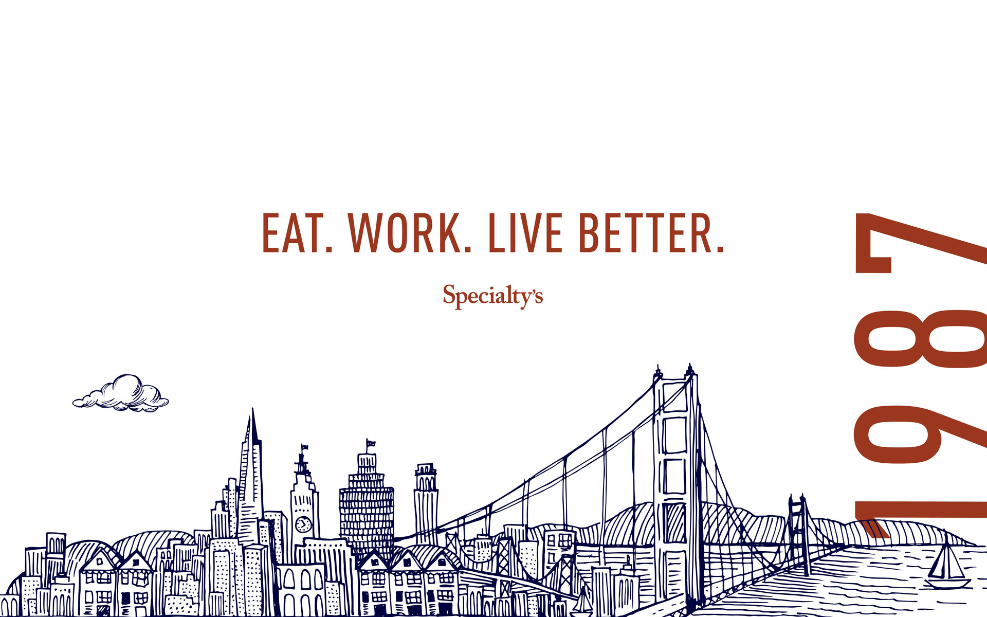
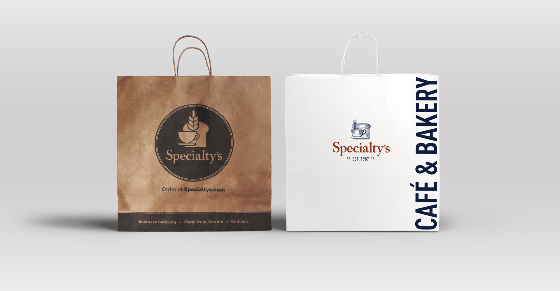
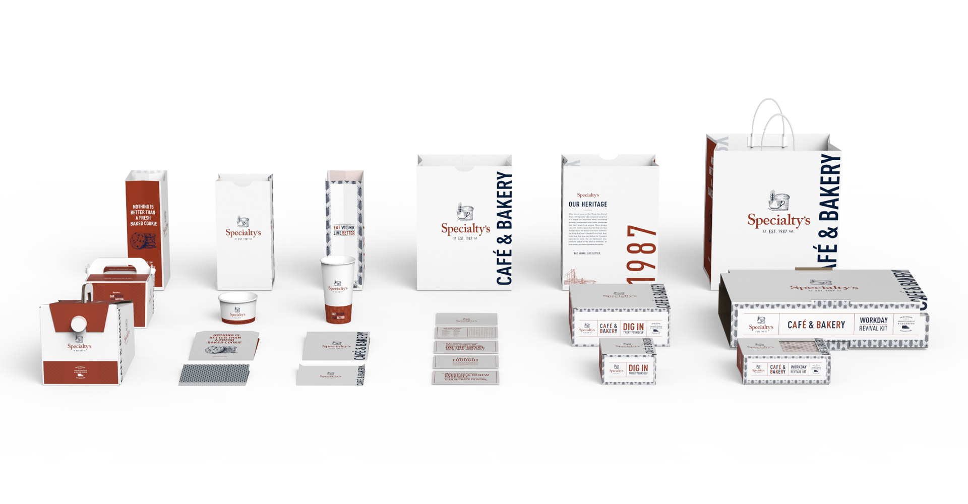
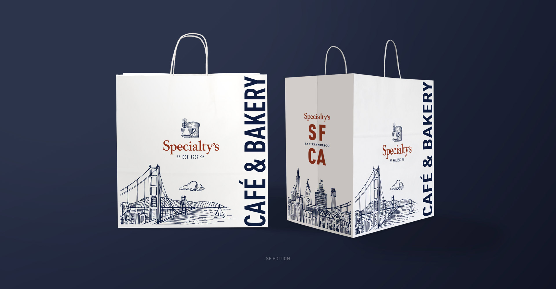
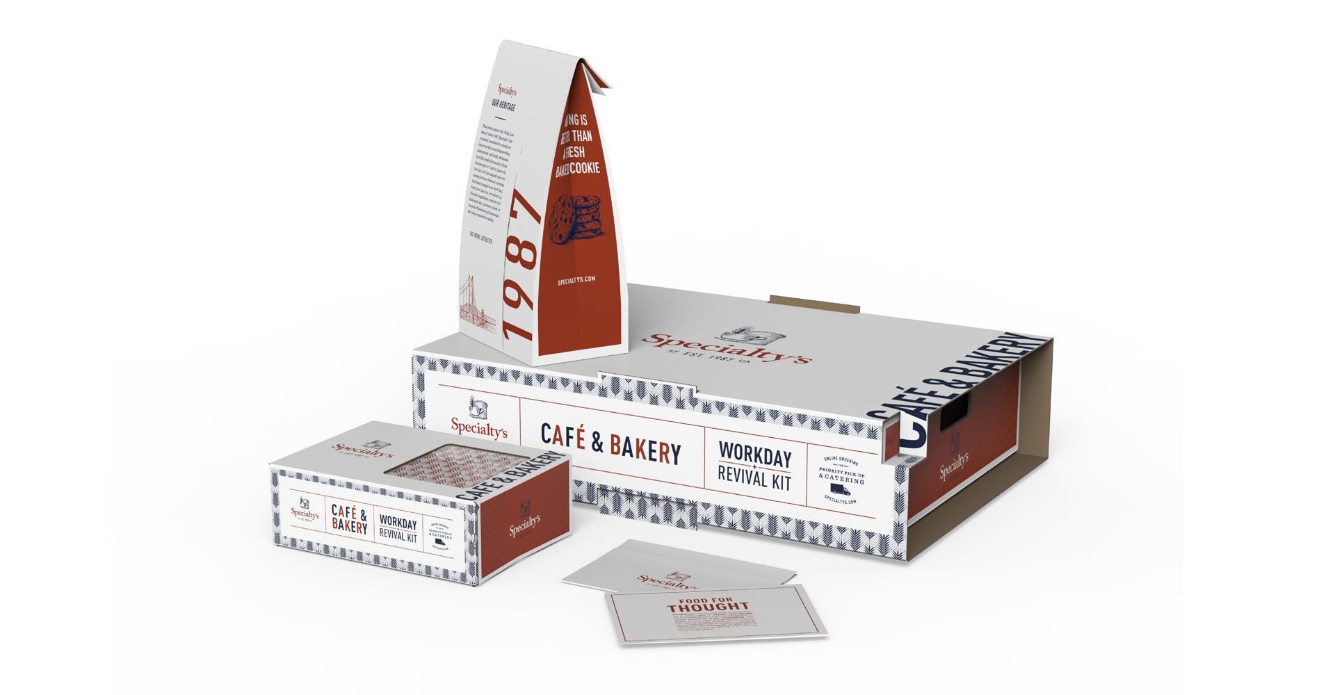
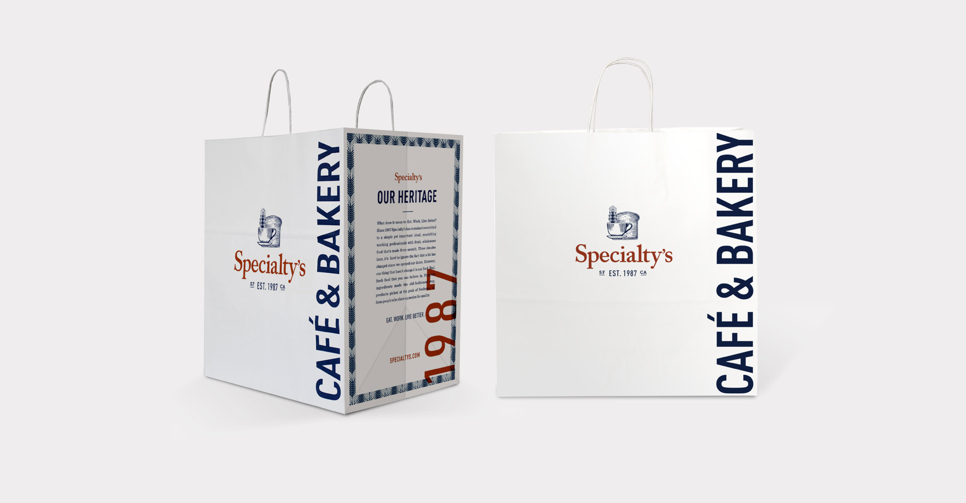
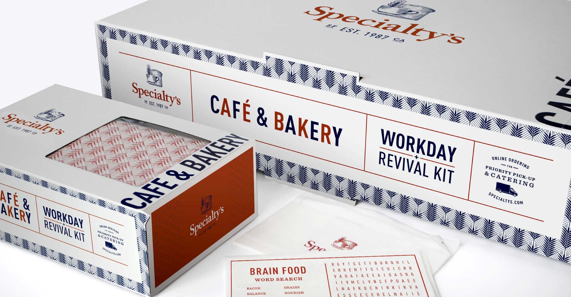
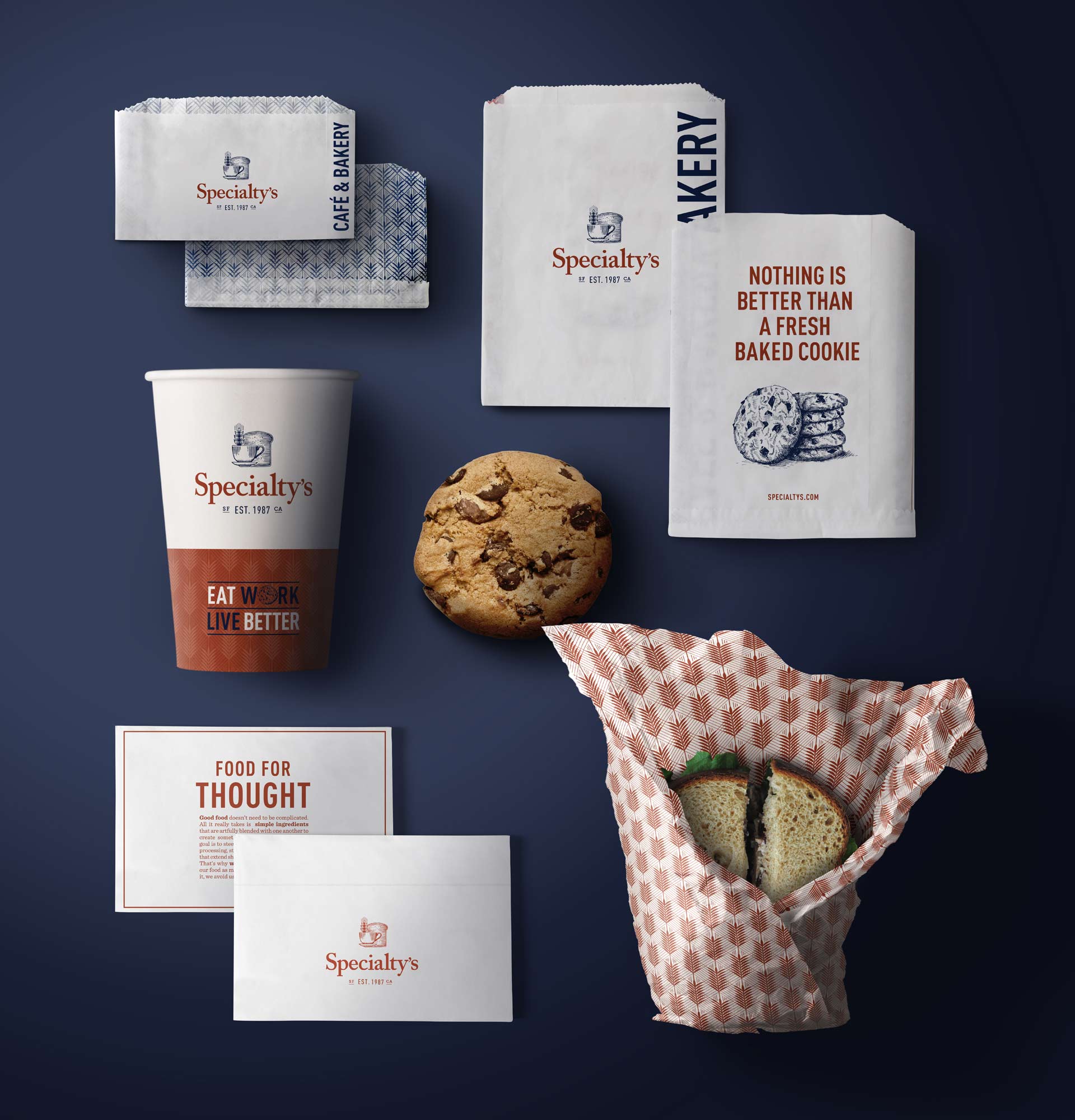
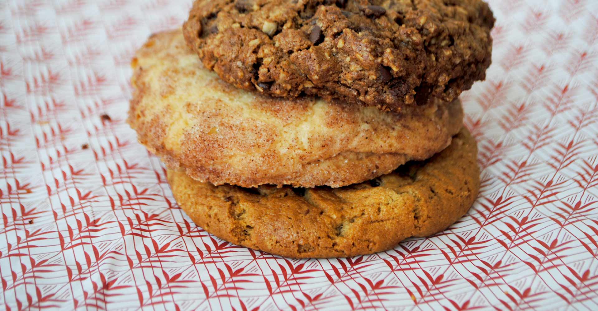
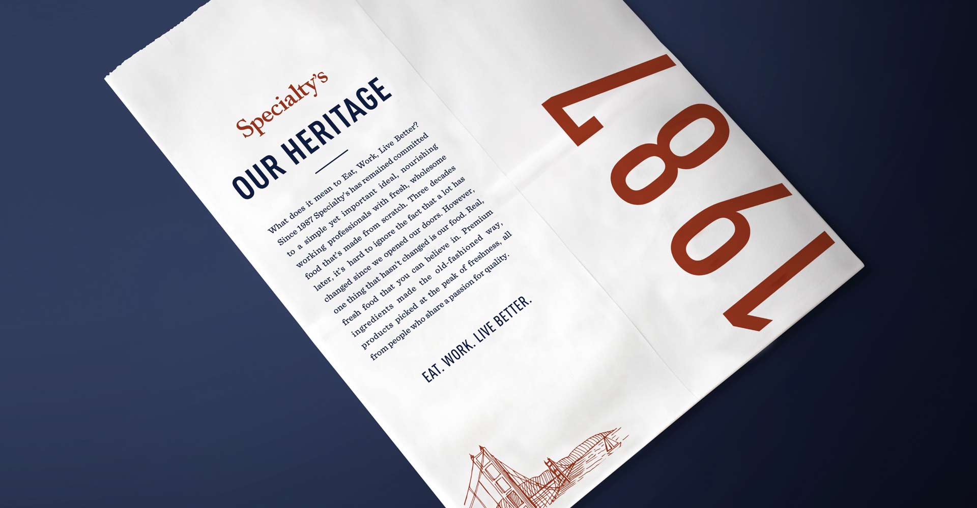
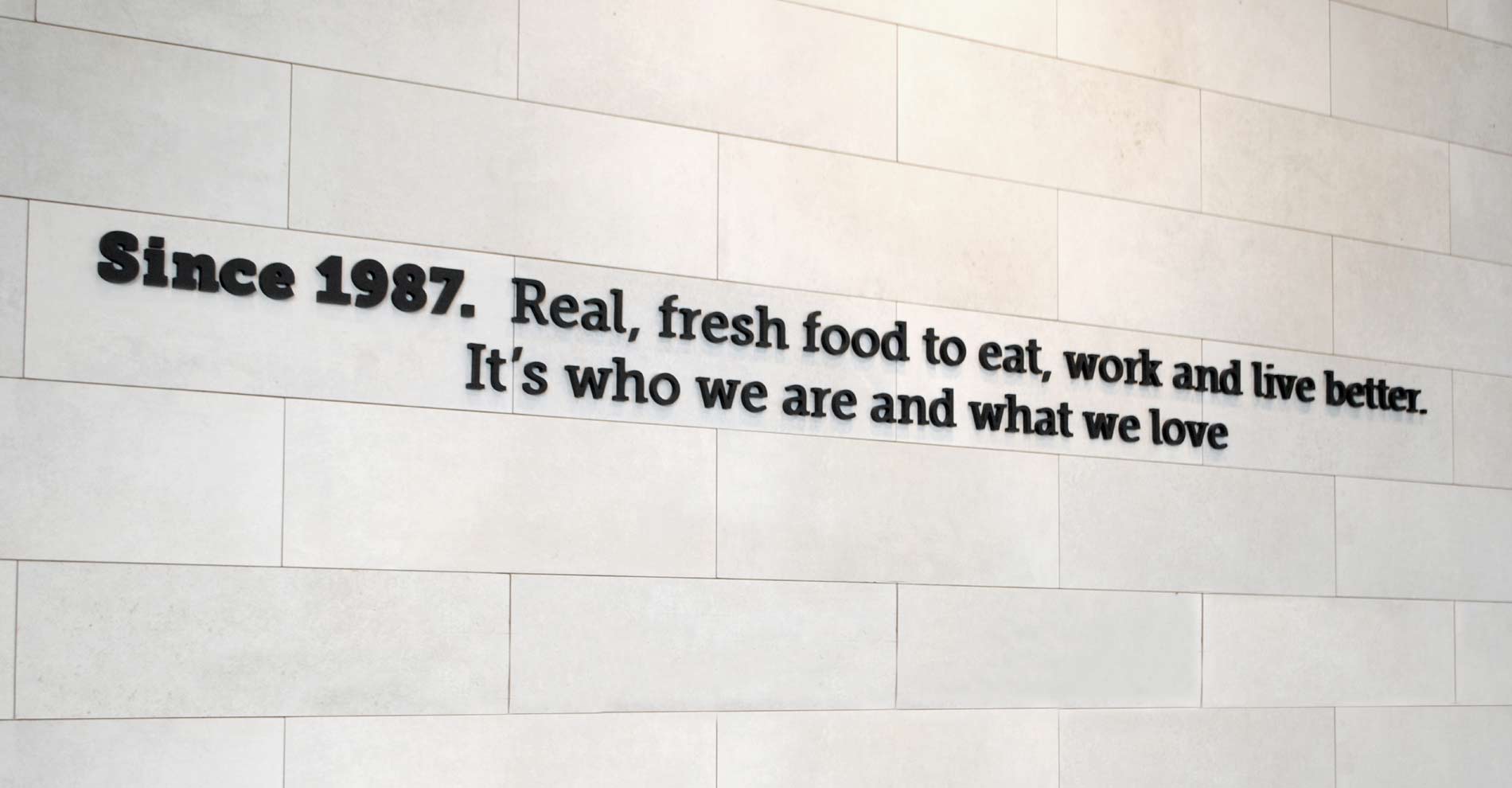
With San Franciscan roots dating back to 1987 and over 40 restaurants and counting, Specialty’s Café and Bakery is one of the fastest growing private companies in the bay area. As the brand enters into new markets, Specialty’s called upon CRP for a packaging redesign. Their goals were three-fold: first, to better educate the consumer about the company’s history, second, to provide a smart way of marketing their core beliefs and service offerings, and third, to reinvigorate the lunch hour. With a large portion of their clientele coming from corporate office environments, CRP drew design inspiration from a variety of sources, including downtown San Francisco signage and classic business attire.
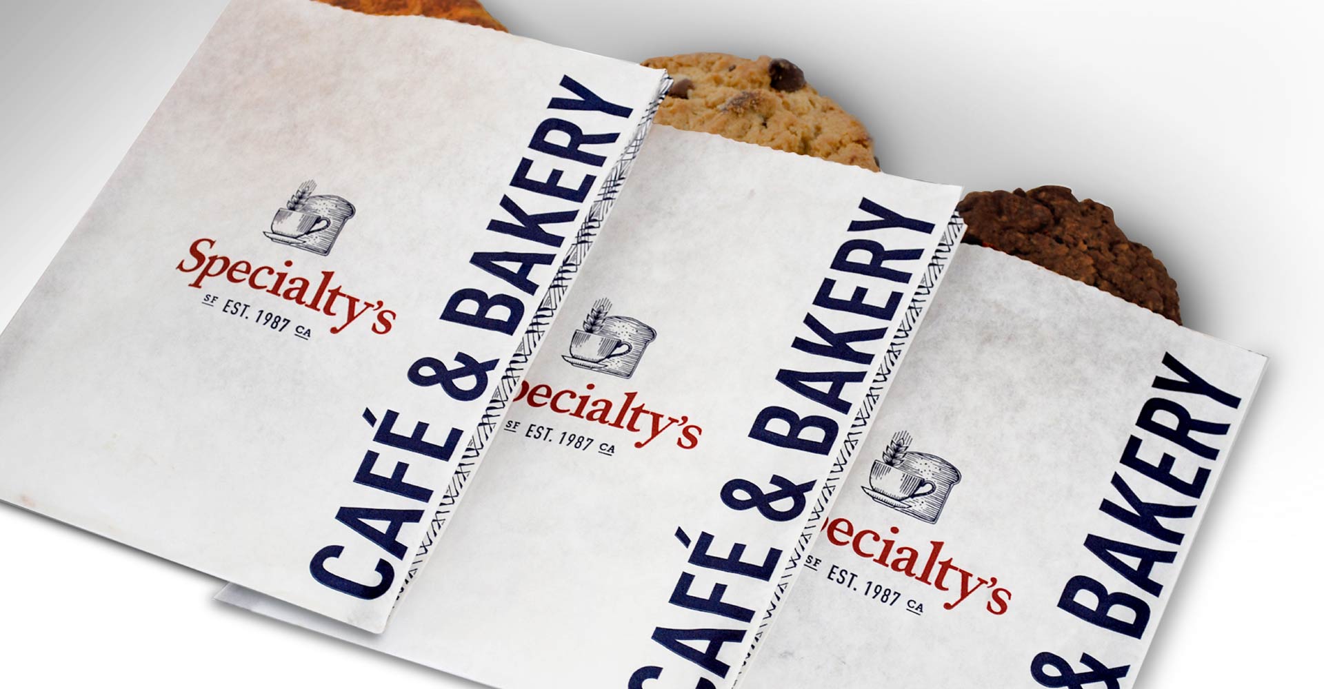
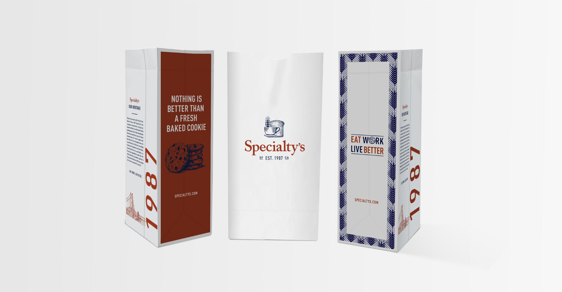
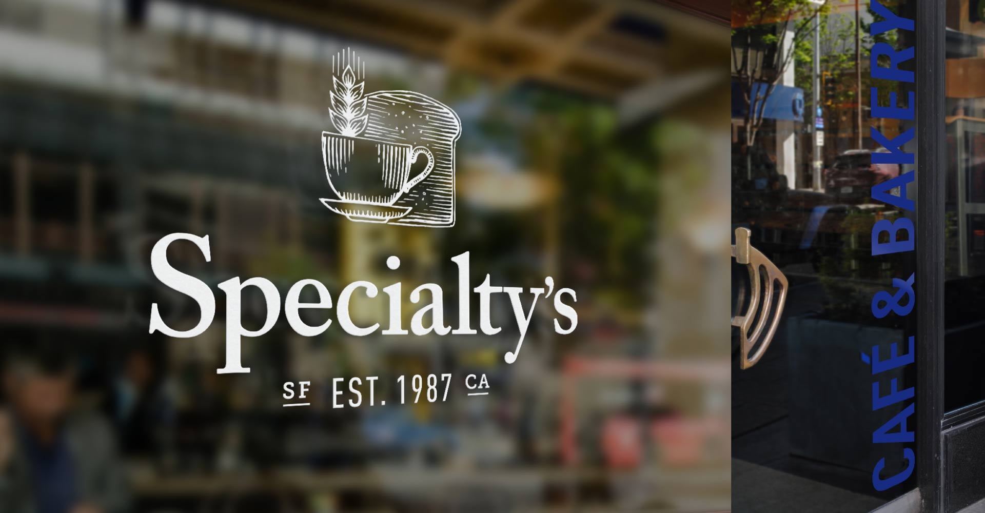
CRP began by setting the primary color scheme for the program. A crisp white background was strategically selected to demonstrate the company’s commitment to fresh ingredients and professional customer service. The pop of red is inspired by the paint color of the Golden Gate Bridge, which is grounded by a classic American navy blue. CRP further animated the designs to include a timeless set of hand-illustrated elements such as the Specialty’s logo, Golden Gate Bridge, San Francisco skyline, and the café’s renowned chocolate chip cookie. Custom patterning provides a textural background, utilizing abstract wheat to simulate a classic herringbone suiting material. Understanding that the packaging many times is a centerpiece on the table during lunchtime meetings, the unique use of typography offers conversational personality that encourages customers to interact with the brand.