2022 COLOR TREND REPORT
Predicting the future isn’t easy. (Ask us at the beginning of 2020 what we thought the year would hold for us, and our responses would be laughable today.) But one prediction we can almost always rely on is Pantone’s color trend report. The color house recently published their predictions for Spring/Summer 2022, based on the shades predominantly shown at 2021’s London Fashion Week.
Here’s what you can expect to see in the world of design next Spring/Summer:
NEUTRAL STAPLES
Deemed as the “core classics” by Pantone, these colors are versatile enough to transcend seasonality.
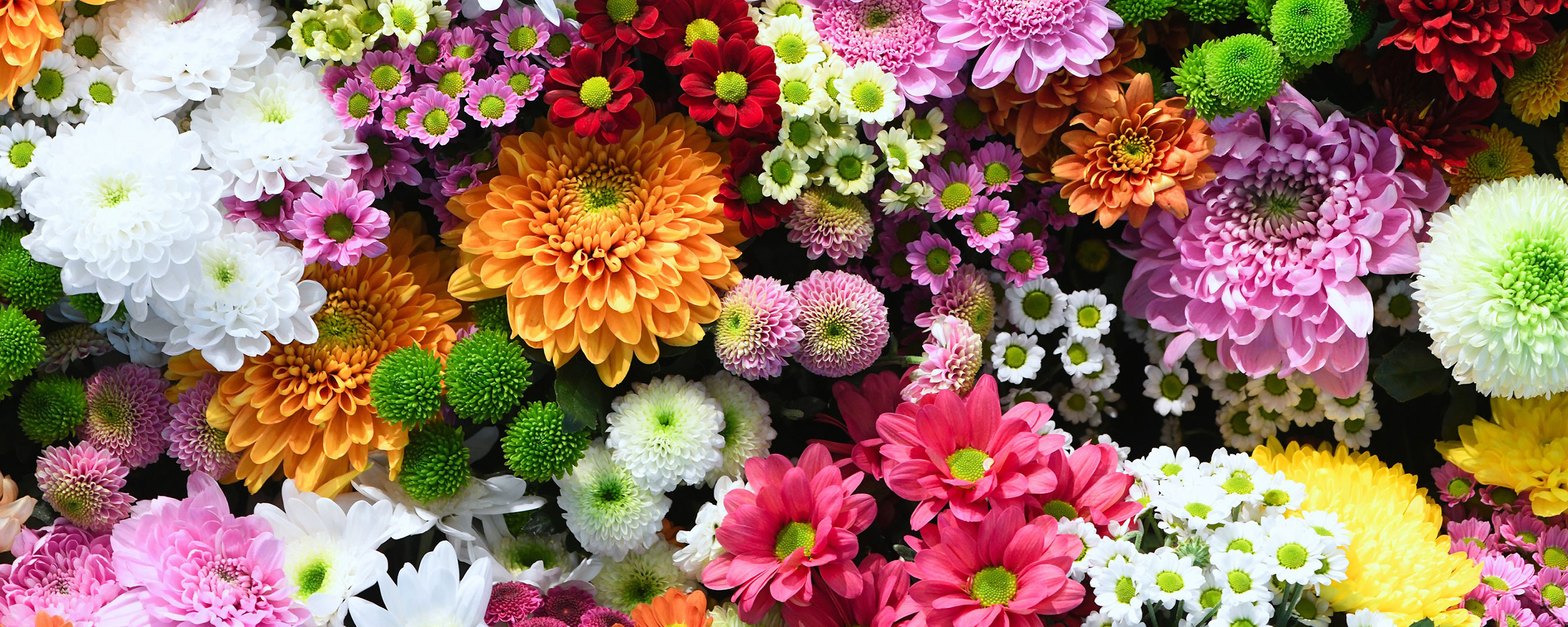
FLORAL INSPIRED HUES
This show-stopping palette invokes feelings of optimism and playfulness, or as Pantone describes it, “a spirt of lightheartedness with functionality and flexibility.”
Check out this video from interior design blog Trend Book for a full immersion into the color story:
PACKAGING APPLICATIONS
We’re buzzing with excitement over the colorful packaging designs we’re seeing that incorporate these classic neutrals and bold pops of color. Here are some that are turning our heads already: