BRAND, IDENTITY, OR LOGO: WHAT’S THE DIFFERENCE?
The answer to that question is: plenty. In our experience, these three terms can be confusing due to a misconception of the specific differences and connections they have with one another.So, let’s start by quickly defining the three, before we go into more detail:
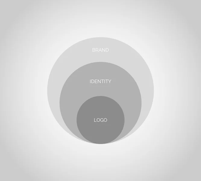
Brand – the physical, intellectual, and emotional perception of a company that contributes to its perceived reputation over time.
Identity – concrete attributes that make up part of the overall brand (i.e., signature color palette, typography).
Logo – the simplest visual form of an identity (i.e., an icon or a wordmark).
In understanding the differences between the terms it’s best to start the process by analyzing the overarching brand message. A logo designed for design’s sake alone – with no thought put into the heart of the brand or the emotional reaction of the consumer – will surely be less effective than the latter method. Sometimes a logo refresh is anything but a quick refresh. The process of developing a strong brand begins by laying down groundwork for the identity and logo to build from. Designing the framework is only a small part of the brand. The majority of a brand image comes from the emotional perception of the public and how they connect to your company – this can be obtained by appealing to the senses: touch, smell, sight, hearing, or even a sentimental memory. Once the brand image is in place, the rest of the company touch-points can follow suit, echoing a consistent voice and set of values. A company identity is made up of the tangible attributes assigned to help visualize the brand and further give it personality. These attributes are carried out in color, typography, stationery, marketing, products and all things visually tied to the brand. One of these visual elements is a company logo. A logo is your brand and identity visually wrapped up into one succinct wordmark and/or icon. A wordmark is a text-only typographic treatment of the company name or product intended to make the brand easily identifiable. This mark is not meant to tell your entire brand story, but rather to stand alone as a representative of it in its entirety. Some logos include an icon (or what we call an “extractable brand unit”) such as Nike’s “swoosh” in tandem with a wordmark, while others may decide to utilize just one or the other. Company logos take time to gain the recognition they’re intended to have, the same way Starbucks took years to separate their icon from their wordmark with confidence that the consumer will fill in the blank. What we like to do – and what we advise our clients do – is to take a step back to the beginning and approach the project with the overarching brand scope in mind in order to development of a thoughtful and engaging solution.